This task was to explore designing in Photoshop and utilise a range of effects.
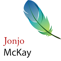
The first design here was based on the Photoshop CS2 logo - it worked well because it seemed light and airy, and it also worked nicely with two words. The second design was based on a tutorial, but it seemed too infornal for a corporate identity due to the roundedness and jelly-likeness. The final design was one designed completely by me and I used techniques learnt from the previous tutorials.


The first design here was based on the Photoshop CS2 logo - it worked well because it seemed light and airy, and it also worked nicely with two words. The second design was based on a tutorial, but it seemed too infornal for a corporate identity due to the roundedness and jelly-likeness. The final design was one designed completely by me and I used techniques learnt from the previous tutorials.


No comments:
Post a Comment